Examples
This page offers selected examples that let users discover the full potential in terms of presentation prowess that the ValTrendsDB database has.
Need help? Click here.
Visualizing quality and features of user's PDB entries
The ValTrendsDB database offers plots of trends between pairs of various factors (for details, please consult the Help that contains a more roundabout introduction to this functionality). These plots are not static though: You can add your own data points to them. That way, you can compare features and/or quality of one or more PDB entries to the trend of a plot of two factors. You do not need to know their PDB IDs. Instead, entries for visualization can be discovered using embedded search field that is connected to to PDB database.
Values of individual PDB entries are visualized in the plot as blue dots. You can hover over the dots to see their ID as well as their values on the X-axis and Y-axis.
Main views of user's PDB entries, which ValTrendsDB offers, are:
- Single structure view
- Protein family structures view
- Author's structures view
- Journal structures view
Single structure view: Quality of the 1tqn entry
On the two figures below, you can see the trends in plots of two relationships: A relationship of clashscore structure quality factor in regard to the year of release, and a relationship of percentage of Ramachandran outliers structure quality factor in regard to the resolution of a structure model. Values of a structure of human microsomal cytochrome P450 3A4 that goes by the PDB ID of 1tqn are visualized in both plots by a blue point. This way you can see that the PDB structure 1tqn has lower quality than other structures published in the same year, or with the same resolution.
Note: Here are links that will lead you to page Explore relationships that is set up to produce the exact same plot as you see here among the examples: Plot 1, Plot 2.
Protein family structures view: Quality of protein structures of the cytochrome P450-cam family
The plot below shows the relationship of the Ramachandran outliers structure quality factor and the year of release factor. Values of 124 PDB structures of the cytochrome P450-cam family are visualized using blue points on top of the trend that is already present in the plot of the relationship. You can see that this protein family contains one structure with markedly lower quality (represented by high value of the Ramachandran outliers structure quality factor): it is the PDB structure 2h7s.
Note: Here is the link that will lead you to page Explore relationships that is set up to produce the exact same plot as you see here among the examples.
Author's structures view: Structures deposited by Dr. Josef Houser
The plot below shows a relationship between clashscore structure quality factor and structure resolution factor. Values of 13 PDB entries that have been deposited to the PDB database by Dr. Josef Houser are visualized in the plot by blue points. The plot demonstrates that structures deposited by Dr. Houser have markedly better quality than average.
Note: Here is the link that will lead you to page Explore relationships that is set up to produce the exact same plot as you see here among the examples.
Journal structures view: A comparison of quality of structures published in journals Nature and Structure
The two plots below depict a relationship of the Ramachandran outliers structure quality factor and the year of release factor. On top of this trend, we show quality of structures published in journals Structure (first plot) and Nature (second plot). Since there were a lot of data points per each journal, both plots visualize only average (blue points) and upper quartile, median, and lower quartile (blue box) for each interval with at least one visualized entry from a journal. We can see that Nature structures have markedly lower quality (higher values of the Ramachandran outliers structure quality factor signify lower quality), which is probably caused by journal’s strong pressure on innovativeness and cutting edge approaches.
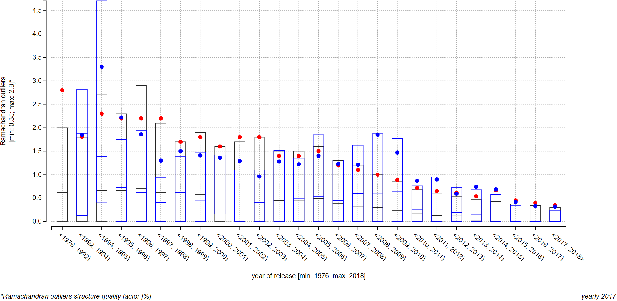
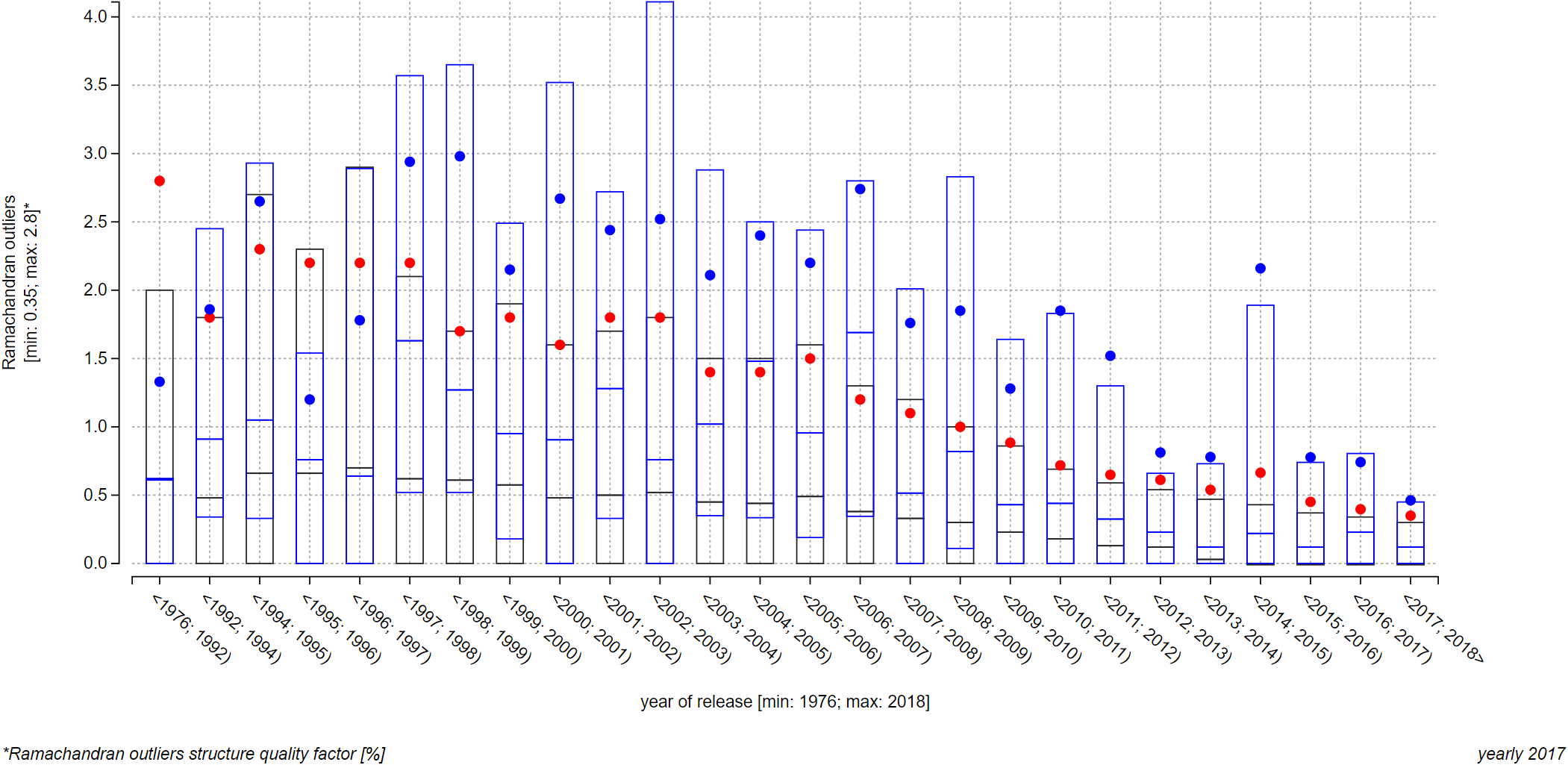
Note: Unfortunately, these plots cannot be realized as the interactive embedded ones because of the 2 000-character URL length limit that contemporary internet browsers have. This limit is relevant to you if you want to provide IDs to the page via its link (using the address bar of you browser, or embedding a ValTrendsDB plot into your own page). You can, however, recreate them in this plot on the Explore relationships page by searching for all structures, published in journals Science or Nature, in the interactive embedded search field. Do not forget do enable the Show average and median for PDB IDs option as well.

Terms of use and GDPR